
Last Updated on February 5, 2025 by Slideson
Charts are powerful tools for visualizing data, making it easier for your audience to grasp complex information quickly and effectively. Whether you’re working on a business presentation, academic report, annual report for your business, or a personal project, adding charts to your Google Slides can significantly enhance the clarity of your data. This guide will walk you through the process of adding and editing charts in Google Slides, including how to import them from Google Sheets and explain how to handle charts when importing PowerPoint files.
Adding Charts in Google Slides
Adding a chart to Google Slides is a quick and simple process, but understanding the available options and their applications is crucial to ensure your data is presented in the best possible way.
Open Your Google Slides Presentation
To start, open the presentation where you plan to place the chart. Next, ensure your slides are properly formatted and ready for data visualization.
Choose the Target Slide
Navigate to the specific slide where you want the chart to appear, ensuring it complements or expands on the points you are discussing.

Insert the Chart in Google Slides
- Click on the “Insert” tab located in the top menu bar.
- From the drop-down menu, select “Chart”.
- A variety of chart types will appear, including Bar, Column, Line, and Pie.
- Select the one that best suits your data presentation needs. Bar charts are great for comparing quantities across categories. Line charts work best for showing trends over time. Pie charts are useful for illustrating parts of a whole.
Chart Placement and Sizing
Once the chart appears on your slide, you can click and drag it to adjust its position. You can also resize the chart by dragging the corners to fit your slide design.
Editing Chart Data in Google Slides
Once you’ve inserted the chart, the next step is to update it with your own data. Google Slides integrates smoothly with Google Sheets, enabling you to modify the chart data effortlessly.
Select the Chart
Click on the chart on your slide, and soon after, a small drop-down arrow will appear in the top-right corner of the chart.

Open Data Source
- Click the drop-down arrow and select “Open source”. This action will automatically open the associated Google Sheets file that contains the chart’s data.
- In Google Sheets, you’ll see a pre-filled spreadsheet with placeholder data that corresponds to the chart displayed in Google Slides.
Modify the Data
In the Google Sheets file, first replace the placeholder data with your actual data. Then, update the categories, labels, and values to accurately reflect the information you want to present.

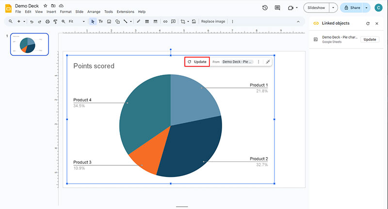
Refresh the Chart
After updating your data in Sheets, return to Slides. At this point, you will notice an “Update” button in the upper-right corner of the chart. Simply click it to refresh the chart with the new data.
This seamless integration guarantees that any changes made in Google Sheets are instantly reflected in your Google Slides chart.
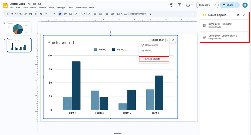
To edit your chart again, select the “Open Source” option. The “Linked Objects” menu option lets you view all linked charts in this deck.
Customizing the Chart Style and Appearance
Now that your data is in place, it’s time to ensure your chart is visually appealing. Customization options in Google Slides allow you to modify the appearance of your chart to fit your presentation’s theme and improve readability.
Access Chart Customization Settings
Double-click on the chart to open the Chart Editor, and shortly after, a sidebar will appear on the right side of your screen, offering various customization options.
Chart Style
- Under the “Customize” tab, you’ll find numerous style options. These include the ability to adjust chart borders, background color, and layout.
- Consider using a background color that contrasts well with your chart’s data to enhance visibility.
Change Series Colors
- Under the “Series” section, you can customize the color scheme of your data series. For example, if you’re presenting data on different regions, using distinct colors for each region will make it easier for the audience to distinguish them.
- You can also alter the line thickness, bar width, and other graphical elements to make certain data points stand out more prominently.
Modify Axis Titles and Labels
- In the “Chart & Axis Titles” section, you can adjust the text for your chart title, horizontal axis, and vertical axis. Ensure your labels are concise but informative to guide the audience in interpreting the chart.
- You can also change the font, size, and color of your labels to match the overall design of your presentation.
Legends and Gridlines
- Adjust the legend’s position and size to avoid overcrowding the slide.
- If needed, you can also modify gridlines and tick marks for a cleaner or more detailed look, depending on your data.
Customizing your chart not only enhances its aesthetic appeal but also helps to communicate your data more clearly and effectively.
Inserting Charts from Google Sheets to Google Slides
If you’ve already created a chart in Google Sheets, you can effortlessly transfer it into Google Slides, eliminating the need to recreate it from scratch.
Open Your Google Slides Presentation
Start by opening the presentation where you want to include the chart.
Select the Target Slide
Navigate to the appropriate slide in the presentation.
Insert the Chart in Google Slides
- Click on the “Insert” tab at the top.
- Select “Chart” from the drop-down menu, and then click on “From Sheets”.
Choose the Chart
- A dialog box will then appear, enabling you to browse and select the Google Sheets file that contains the chart you want to insert.
- After selecting the file, choose the specific chart from the spreadsheet.
Linking Options
- Google Slides provides the option to link the chart to the original Google Sheets file. When you link the chart, any future changes made in Google Sheets will automatically sync and update within your Google Slides presentation.
- If you don’t want the chart to update automatically, deselect the linking option.
Import the Chart
Click “Import” to insert the chart into your slide. Consequently, the chart will retain all its original formatting and data, making it a seamless addition to your presentation.
This method is particularly useful when working on complex data that may change over time, as it ensures your presentation stays up-to-date without requiring manual edits.
Rebuilding Charts in Google Slides from PowerPoint Imports
If you’re transitioning from PowerPoint to Google Slides, you may encounter some challenges when it comes to charts. When importing a PowerPoint file into Google Slides, any charts embedded in the PowerPoint presentation are usually converted into static images. This means you lose the ability to edit the data or customize the chart within Google Slides.
Manually Recreate Charts
- If your charts are crucial to the presentation, you will need to manually recreate them in Google Slides.
- Refer to the original data from the PowerPoint file and follow the steps outlined earlier to insert a new chart in Google Slides.
Utilize Google Sheets
- If you have access to the raw data from the PowerPoint charts, input it into Google Sheets.
- From there, you can insert the chart directly into Google Slides, allowing for easy updates and customization.
Although this extra step may require more time initially, recreating the charts in Google Slides will give you far more flexibility to adjust styles, update data, and ensure everything looks professional.
Conclusion
Mastering the process of adding, editing, and customizing charts in Google Slides enables you to present your data in a visually compelling and informative manner. Whether you’re importing charts from Google Sheets, recreating them from PowerPoint, or building them from scratch, these tools ensure that your presentations are both polished and effective. With some customization and careful attention to detail, your charts can transform into a powerful storytelling tool that significantly enhances the impact of your message.
Free professional PowerPoint and Google Slides presentation templates. Boost your presentations with Slideson! Want to write for us? Become a contributor.
Related Articles
How Public Speaking Skills Can Fuel Your Business Growth
How to Use Adobe Illustrator Shapes in PowerPoint
Planner Templates to Help You Stay Organized All Year
10 Tips for Leveraging the Power of SlideShare for Visual Content Marketing
How to Combine PowerPoint Templates
Tips for Creating a Stunning Sales Deck
How to Use Mind Mapping to Boost Productivity and Organization
How to Add and Edit Charts in Google Slides
Free Presentation Templates
Marketing Plan Template
Business Presentation Template
Portfolio PowerPoint Template
Company Profile PowerPoint Template
Pitch Deck PowerPoint Template
Gradient PowerPoint Template
Startup Pitch Deck
Device Mockups for PowerPoint
Project Planning PowerPoint Template